Spotlight on the Student Agenda Designers
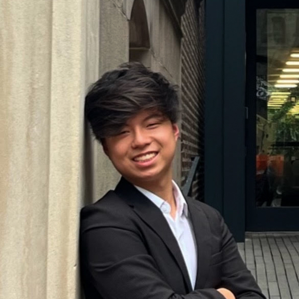
Tony Zhang (III)

The front cover of Boston Latin School’s 2022-2023 agenda book features four vertical rectangles, topped by two horizontal ones. At first glance, the design looks like one column. Tony Zhang (III) wanted the design cover to be four columns, like those in front of the school. He admits that “it can be interpreted in many ways.”
Last spring, BLS announced a Student Agenda Book Design Contest, which Zhang discovered through his friend. He created drafts using Figma, an interface design app.
Zhang explains the thought process behind his creation: “I felt like something […] pretty simple, pretty plain that just tells you that it’s an agenda book and has something related to the school on it […would] be cool.”
The agenda book’s front cover uses the font Futura, a famous Sans-serif design used by many companies and films. As mentioned on the back of the cover page, Futura has historical significance, making it a meaningful choice. Zhang also appreciates its geometric quality, matching the agenda book’s visual.
Zhang relates the cover’s minimalism to his artistic style, saying, “I’m more interested in the practical, design part of things […] I guess a good analogy is sculpture versus architecture. I’m more of the architecture kind of person.”
Zhang prefers simple graphic designs over elaborate artwork. In the past, he has made a logo and posters for the BLS History Club. Outside of school, he designs posters for others as well.
Besides graphic design, Zhang dabbles in photography. His primary interests, however, lie in computer science. I make some websites where it’s more about layout […or] aspects of the page people will focus on, and less about drawing,” he explains. He enjoys programming and user interface-related projects.
In his free time, Zhang likes to help others who need websites, posters or even designs similar to the one he created for BLS’s agenda book.
Tobias Martin (III)
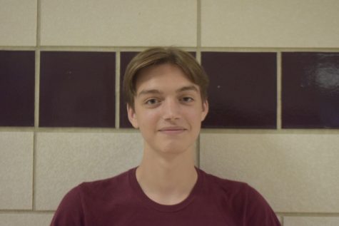
Each fall, Boston Latin School students await the design of the new agenda books. Last year, BLS held a Student Agenda Book Design Contest. The winner of the back cover design was Tobias Martin (III), who created a stunning sketch of the school building facade.
Martin entered to change the “blank gray design” of past agenda books. He believes that those visuals “fit the school still reeling from [COVID-19].” He introduced a vibrant image that would add positivity for the new school year.
Martin chose to present the facade because it is “what you see in the news when the school is getting coverage; it’s the first thing you see in the morning and the last thing you see when leaving. It means something different to everyone, but it always holds […] significance.” The iconic feature symbolizes BLS’s distinguished reputation, and his depiction of it is impressive and accurate.
The digital sketch on the back cover, however, is not the final version of Martin’s artwork. The final design was meant to be a 3D model of the area around the Alma Mater. Martin accidentally sent in the wrong file, submitting a previous draft. Despite this, Martin’s design was still a strong representation of BLS. While Martin is disappointed that he did not submit his desired artwork, he is still “happy to […] contribute to the identity of the school.”
Martin’s interest in 3D modeling began at age nine, primarily using the software, Blender. His passion for the medium lies in “its versatility. Anything you do in one project can be reused.” He notes that with 3D modeling there is more room to experiment with styles than in non-digital media.
For anyone looking to follow in his footsteps, Martin advises them to “make a donut with frosting and sprinkles in any 3D programming! You learn all the basics really well […] and you can be as detailed or cartoony as you like.”


